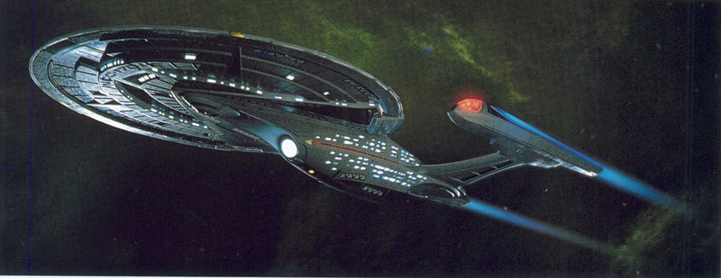
Designing the Enterprise NCC-1701-E - By John Eaves.
Star Trek: First Contact gave John Eaves the opportunity of a lifetime when his boss Herman Zimmerman
asked him to design a new starship Enterprise. As he recalls, he was determined that the new ship would
be sleek, fast, and muscular.
 It began in the fall of 1995. John Eaves was working in the Star Trek: Deep Space Nine art department
when his boss, production designer Herman Zimmerman, stopped by his desk and told him to start work on
the biggest job of his career. "Herman just kind of casually said, 'We're going to start work on the new
movie soon. I haven't got a. script yet, but we're going to need a new Enterprise. I need some sketches
as soon as you can.' It was only when I went home and started doing sketches that it sunk in what he had
asked me to do. It's every school kid's dream to design an Enterprise." As Eaves started to sketch, he
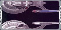
inevitably thought about how his Enterprise would differ from its predecessor. Years earlier he had been
involved in building the four-foot miniature of the
U.S.S. Enterprise NCC-1701-D that was used on the TV
series, and says that he had always been a little ambivalent about the design. "I remember looking at the
blueprints and thinking, 'I don't know if I like this or not.' It was so different than what I was used
to thinking an Enterprise would be. And, building that model, I realized that there were only a few
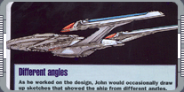
angles you could film it from." Eaves was determined that the new Enterprise would look good from a
variety of angles, but he says that he had no intention of abandoning the basic shape that Matt Jefferies
had established on the original series. "You know the primary shapes you have to use - the body, the
nacelles, and the saucer. I just had to configure those in some kind of new architecture. That was the
primary focus."
It began in the fall of 1995. John Eaves was working in the Star Trek: Deep Space Nine art department
when his boss, production designer Herman Zimmerman, stopped by his desk and told him to start work on
the biggest job of his career. "Herman just kind of casually said, 'We're going to start work on the new
movie soon. I haven't got a. script yet, but we're going to need a new Enterprise. I need some sketches
as soon as you can.' It was only when I went home and started doing sketches that it sunk in what he had
asked me to do. It's every school kid's dream to design an Enterprise." As Eaves started to sketch, he
inevitably thought about how his Enterprise would differ from its predecessor. Years earlier he had been
involved in building the four-foot miniature of the
U.S.S. Enterprise NCC-1701-D that was used on the TV
series, and says that he had always been a little ambivalent about the design. "I remember looking at the
blueprints and thinking, 'I don't know if I like this or not.' It was so different than what I was used
to thinking an Enterprise would be. And, building that model, I realized that there were only a few
angles you could film it from." Eaves was determined that the new Enterprise would look good from a
variety of angles, but he says that he had no intention of abandoning the basic shape that Matt Jefferies
had established on the original series. "You know the primary shapes you have to use - the body, the
nacelles, and the saucer. I just had to configure those in some kind of new architecture. That was the
primary focus."
 The script for Star Trek: First Contact also gave Eaves some important guidance. It described the
Enterprise-E as a more advanced, faster ship that was designed to fight the Borg. On
Star Trek: Generations he had had the opportunity to modify the
Excelsior to turn it in to the
Enterprise-B; he had been struck by its length and the
beauty of its design, and says there is no question that it influenced his thinking about the E.
"I definitely wanted to have a sleeker-looking ship, like the Excelsior. I wanted it to look like it
could go real fast. To me, the shapes on the D looked almost like they wouldn't be able to handle that
kind of speed. So I thought, in an architectural sense, they needed to be longer and a lot more
streamlined. Even though it looks smaller than the D mass-wise, it's actually a longer ship." Eaves
rapidly decided to stretch the engineering hull out, giving it a much more extended shape, but he wasn't
sure what to do with the saucer. "I went through the whole gamut of shapes. I thought I'd start with the
round saucer just to see how it would look on a sleeker kind of body frame. But that was almost going too
far back in time with the design, since the oval had been established. I thought at least that shape
should carry on. So I rotated it around to give the impression of speed and power." Eaves remembers that
while he was working on these early sketches he was rather secretive. He was concerned that if he showed
an incomplete idea to Zimmerman and the producers they might latch on to something he wasn't happy with,
so he didn't submit any drawings until he was confident that he had found the right direction.
"Eventually I came up with one shape from the side that I liked. I showed it to Herman. He liked it and
said, 'OK, keep going with that'"
The script for Star Trek: First Contact also gave Eaves some important guidance. It described the
Enterprise-E as a more advanced, faster ship that was designed to fight the Borg. On
Star Trek: Generations he had had the opportunity to modify the
Excelsior to turn it in to the
Enterprise-B; he had been struck by its length and the
beauty of its design, and says there is no question that it influenced his thinking about the E.
"I definitely wanted to have a sleeker-looking ship, like the Excelsior. I wanted it to look like it
could go real fast. To me, the shapes on the D looked almost like they wouldn't be able to handle that
kind of speed. So I thought, in an architectural sense, they needed to be longer and a lot more
streamlined. Even though it looks smaller than the D mass-wise, it's actually a longer ship." Eaves
rapidly decided to stretch the engineering hull out, giving it a much more extended shape, but he wasn't
sure what to do with the saucer. "I went through the whole gamut of shapes. I thought I'd start with the
round saucer just to see how it would look on a sleeker kind of body frame. But that was almost going too
far back in time with the design, since the oval had been established. I thought at least that shape
should carry on. So I rotated it around to give the impression of speed and power." Eaves remembers that
while he was working on these early sketches he was rather secretive. He was concerned that if he showed
an incomplete idea to Zimmerman and the producers they might latch on to something he wasn't happy with,
so he didn't submit any drawings until he was confident that he had found the right direction.
"Eventually I came up with one shape from the side that I liked. I showed it to Herman. He liked it and
said, 'OK, keep going with that'"
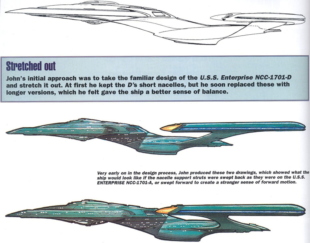
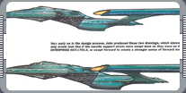
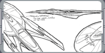
 In profile this Enterprise is not unlike a stretched out version of the D, and still has that ship's
short warp nacelles. Eaves says that at this stage he was still being quite cautious, but now that he had
the go-ahead to explore the design he started to suggest more radical changes. The first was extending
the nacelles. "I loved the older look with the long nacelles, and I thought that with the new powerplants
and the new technology behind it a longer, sleeker nacelle would balance the craft better." Another
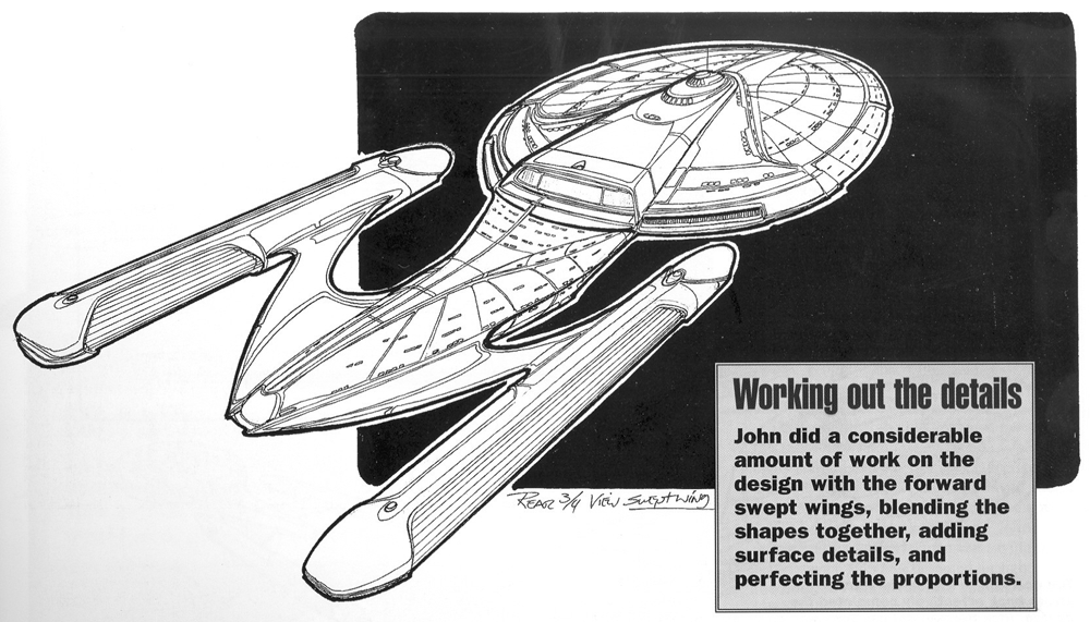
modification Eaves wanted to try was sweeping the nacelle struts forward rather than back. He felt this
would give the ship a more advanced look, and produced two drawings that showed the difference between
his new struts and the traditional version. Rick Berman approved of the new approach and Eaves continued
to develop it in the next round of drawings. Eaves says that Berman's comments were extremely perceptive,
but, on the whole, he didn't concern himself with the tiny details. "He was definitely someone who liked
a nice shape, a nice design. He wasn't looking at it technically or scientifically; he was looking for
something that was new and very, very different. His comments would be 'move things' as opposed to
'change things.'" The most obvious change that came at this stage involved the neck section, which
connected the engineering and saucer section. This was now blended into the body of the ship, creating a
much more compact shape. "The neck went away early on," Eaves recalls. "From what Herman was saying this
was a special Enterprise designed for fighting the Borg, so I wanted to take out any vulnerability. I
always thought that neck was a prime target. When it was attacked in Wrath of Khan I thought, 'Man, if
they had hit it for just a few more seconds it would have snapped off and that would have been the end of
In profile this Enterprise is not unlike a stretched out version of the D, and still has that ship's
short warp nacelles. Eaves says that at this stage he was still being quite cautious, but now that he had
the go-ahead to explore the design he started to suggest more radical changes. The first was extending
the nacelles. "I loved the older look with the long nacelles, and I thought that with the new powerplants
and the new technology behind it a longer, sleeker nacelle would balance the craft better." Another
modification Eaves wanted to try was sweeping the nacelle struts forward rather than back. He felt this
would give the ship a more advanced look, and produced two drawings that showed the difference between
his new struts and the traditional version. Rick Berman approved of the new approach and Eaves continued
to develop it in the next round of drawings. Eaves says that Berman's comments were extremely perceptive,
but, on the whole, he didn't concern himself with the tiny details. "He was definitely someone who liked
a nice shape, a nice design. He wasn't looking at it technically or scientifically; he was looking for
something that was new and very, very different. His comments would be 'move things' as opposed to
'change things.'" The most obvious change that came at this stage involved the neck section, which
connected the engineering and saucer section. This was now blended into the body of the ship, creating a
much more compact shape. "The neck went away early on," Eaves recalls. "From what Herman was saying this
was a special Enterprise designed for fighting the Borg, so I wanted to take out any vulnerability. I
always thought that neck was a prime target. When it was attacked in Wrath of Khan I thought, 'Man, if
they had hit it for just a few more seconds it would have snapped off and that would have been the end of
 the ship!' On the D I thought the neck was too heavy. I definitely wanted it to blend, and it turned out
it worked best just eliminating that neck altogether and tapering the scoop of the deflector dish from
the body all the way up to the torpedo launcher." One of Rick's most important notes was that the
Enterprise-E should be an entirely new ship that had a distinct identity. This meant that some ideas were
off the agenda. "At one point," Eaves says, "Herman was thinking, 'What do you say the nacelles move like
they do on Voyager?' We figured that was how new warp engines worked. That was one of the heavy printed
notes that came back from Rick Berman - 'We don't want any Voyager connotations.' Anything that moved he
really didn't want to go with, so that went away very quickly."
the ship!' On the D I thought the neck was too heavy. I definitely wanted it to blend, and it turned out
it worked best just eliminating that neck altogether and tapering the scoop of the deflector dish from
the body all the way up to the torpedo launcher." One of Rick's most important notes was that the
Enterprise-E should be an entirely new ship that had a distinct identity. This meant that some ideas were
off the agenda. "At one point," Eaves says, "Herman was thinking, 'What do you say the nacelles move like
they do on Voyager?' We figured that was how new warp engines worked. That was one of the heavy printed
notes that came back from Rick Berman - 'We don't want any Voyager connotations.' Anything that moved he
really didn't want to go with, so that went away very quickly."
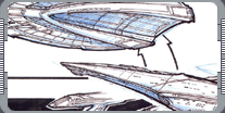
For the surface textures, Eaves wanted to recreate the feeling of the refit Enterprise from Star Trek:
The Motion Picture. 'Anything that has a raised surface would be an obstruction, so I wanted a smooth
look. If you look at old boats or airplanes, the heavier the paneling, the slower they went. I always
thought the A was just beautiful. That's kind of how the E was done as well." However, Eaves did add a
major new structural element - the triangular shapes on the top and bottom of the saucer. "I was thinking
 about warp technology," he explains. "I felt that at high speeds it would act sort of like a warp flow -
that shape would enhance that. That's something I would dedicate to Mike and Denise Okuda, because they'd
come along and say, 'Have you heard about this technology?' or something. And that's kind of where that
came from. "It's also one of those old art school things. As an artist you're determining where you want
the viewer's eye to go. I was trying to demonstrate speed, no matter where you look at the ship.
Anything pointing forward would draw your eye and make the ship look fast. Even if it's parked it looks
fast." A considerable amount of work was done on this version of the design. "We explored it all the way
to putting windows and panel line breakup on it. Mr. Berman saw it and he kind of liked that direction,
so we kept going. Then we started doing the top views and Fritz [Zimmerman], who is one of the set
designers, came over. He said, 'You know, if you look at it like this, it looks like a big turkey in a
pan!' And he was right! We laughed, and when we told Herman he said, 'Oh, my gosh! Get rid of that.'
"Putting the struts back said, 'This is an Enterprise.' It had that really nice feel that the A had.
From there Mr. Berman really liked it. He put notes on it like 'lower the nacelles,' 'bring the body down
a little bit.' Really specific notes like that, but he said, 'This is pretty much it.'"
about warp technology," he explains. "I felt that at high speeds it would act sort of like a warp flow -
that shape would enhance that. That's something I would dedicate to Mike and Denise Okuda, because they'd
come along and say, 'Have you heard about this technology?' or something. And that's kind of where that
came from. "It's also one of those old art school things. As an artist you're determining where you want
the viewer's eye to go. I was trying to demonstrate speed, no matter where you look at the ship.
Anything pointing forward would draw your eye and make the ship look fast. Even if it's parked it looks
fast." A considerable amount of work was done on this version of the design. "We explored it all the way
to putting windows and panel line breakup on it. Mr. Berman saw it and he kind of liked that direction,
so we kept going. Then we started doing the top views and Fritz [Zimmerman], who is one of the set
designers, came over. He said, 'You know, if you look at it like this, it looks like a big turkey in a
pan!' And he was right! We laughed, and when we told Herman he said, 'Oh, my gosh! Get rid of that.'
"Putting the struts back said, 'This is an Enterprise.' It had that really nice feel that the A had.
From there Mr. Berman really liked it. He put notes on it like 'lower the nacelles,' 'bring the body down
a little bit.' Really specific notes like that, but he said, 'This is pretty much it.'"
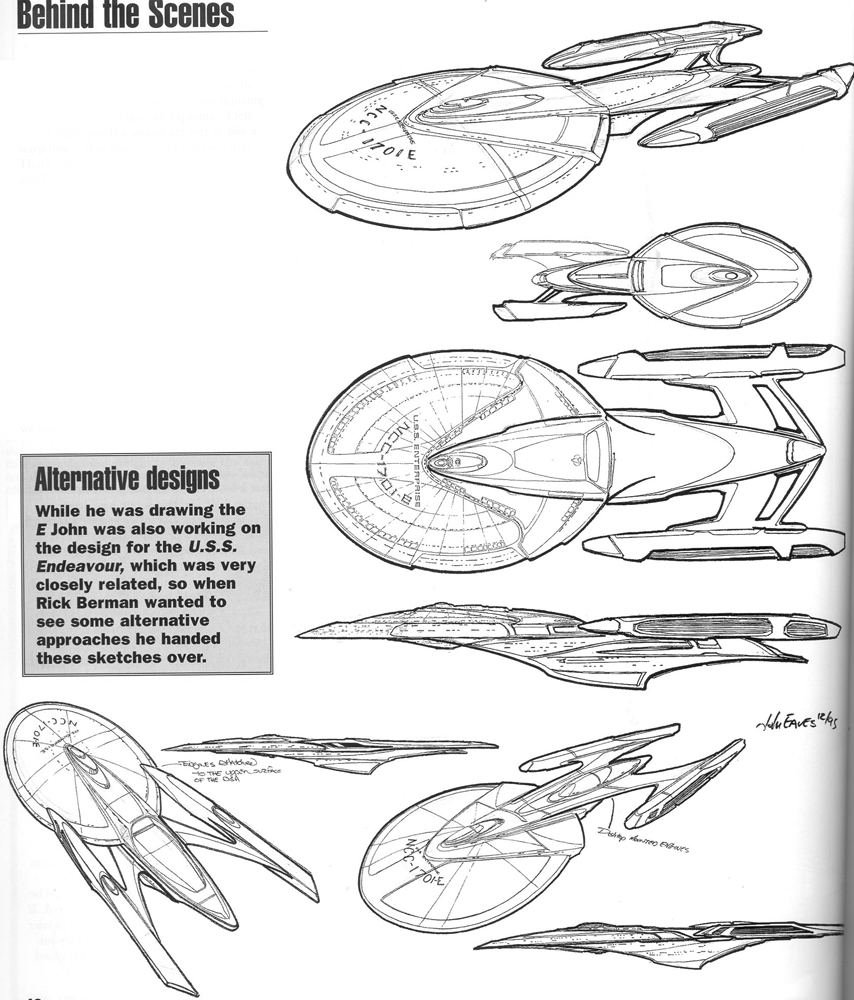
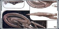
 After another pass, Rick was satisfied, and declared that they had found their Enterprise. But he wanted
to be sure that this was the absolute best way to go, so he asked Eaves to produce some alternative
designs. Fortunately, Eaves says, in a way he had already done some work on an alternate version of the
E. "In the early script there had been a ship called the Endeavour that used to play quite a big role. I
was drawing that and the E at the same time. They were kind of similar shapes, so it was almost a way of
trying things out. I thought, 'If I want to see this on the E, let me try it on the Endeavour sketches
first.' I'd mess around with the body, tapering it to the nacelles in one sweepy part, things like that.
It was definitely an idea platform for me. So, at this point I just put Enterprise on all the Endeavour
sketches, because by that time Endeavour was gone and nobody had ever seen them!" The alternative
designs convinced Rick that they had made the right decisions all along, and the E was approved. Rick
Sternbach was brought in to draw up the blueprints that were sent to ILM, while Eaves prepared detail
drawings of important areas like the deflector dish and the bridge module. Eaves says that he knew the
team working on the model at ILM - which included John Goodson, John Knowle, and Bill George were all
masters of their craft, who had worked on Star Trek ships before, including the Excelsior. "I didn't want
to give them too much information; I'd rather they have their chance to be creative as well. So I wanted
the sketch to be just an idea. They took it from there to put the things that they knew so well in to the
model. John Goodson and I would talk almost every day, and we cleared up all sorts of details as they
built the model."
After another pass, Rick was satisfied, and declared that they had found their Enterprise. But he wanted
to be sure that this was the absolute best way to go, so he asked Eaves to produce some alternative
designs. Fortunately, Eaves says, in a way he had already done some work on an alternate version of the
E. "In the early script there had been a ship called the Endeavour that used to play quite a big role. I
was drawing that and the E at the same time. They were kind of similar shapes, so it was almost a way of
trying things out. I thought, 'If I want to see this on the E, let me try it on the Endeavour sketches
first.' I'd mess around with the body, tapering it to the nacelles in one sweepy part, things like that.
It was definitely an idea platform for me. So, at this point I just put Enterprise on all the Endeavour
sketches, because by that time Endeavour was gone and nobody had ever seen them!" The alternative
designs convinced Rick that they had made the right decisions all along, and the E was approved. Rick
Sternbach was brought in to draw up the blueprints that were sent to ILM, while Eaves prepared detail
drawings of important areas like the deflector dish and the bridge module. Eaves says that he knew the
team working on the model at ILM - which included John Goodson, John Knowle, and Bill George were all
masters of their craft, who had worked on Star Trek ships before, including the Excelsior. "I didn't want
to give them too much information; I'd rather they have their chance to be creative as well. So I wanted
the sketch to be just an idea. They took it from there to put the things that they knew so well in to the
model. John Goodson and I would talk almost every day, and we cleared up all sorts of details as they
built the model."
 The biggest changes in the design of the Enterprise involved the warp nacelles and the way they connected
to the engineering hull. "In the version I sent them, the whole front end of the nacelle was a big
Bussard collector. It was this open-ended glowing orb. Then the blue light went all the way to the back
uninterrupted. That went back and forth. When ILM started building the model, John called me up and said,
'What do you say we build framework around the front end of the Bussard collector?' I said that would be
fantastic. So he came up with the way that was cowled over at the front. "The way the strut connected to
the nacelle was kind of the gray area in the blueprints. There wasn't actually a print that showed where
they attached. Herman asked me to make a study model for the ILM guys and to help solve some problems
here on the lot. It took forever to do, and it was a big event to make everything line up. In doing that
I pulled the struts back on the body a little bit and moved their location on the nacelle a little closer
to the center. I sent that to ILM. My strut kind of tapered with the body as it curved at the back, but
it was very difficult to have that work on a bigger model. Bill George said, 'What do you say we have it
come out of the body on a parallel line so we can angle up with a more graceful angle?' So that's what we
did."
The biggest changes in the design of the Enterprise involved the warp nacelles and the way they connected
to the engineering hull. "In the version I sent them, the whole front end of the nacelle was a big
Bussard collector. It was this open-ended glowing orb. Then the blue light went all the way to the back
uninterrupted. That went back and forth. When ILM started building the model, John called me up and said,
'What do you say we build framework around the front end of the Bussard collector?' I said that would be
fantastic. So he came up with the way that was cowled over at the front. "The way the strut connected to
the nacelle was kind of the gray area in the blueprints. There wasn't actually a print that showed where
they attached. Herman asked me to make a study model for the ILM guys and to help solve some problems
here on the lot. It took forever to do, and it was a big event to make everything line up. In doing that
I pulled the struts back on the body a little bit and moved their location on the nacelle a little closer
to the center. I sent that to ILM. My strut kind of tapered with the body as it curved at the back, but
it was very difficult to have that work on a bigger model. Bill George said, 'What do you say we have it
come out of the body on a parallel line so we can angle up with a more graceful angle?' So that's what we
did."
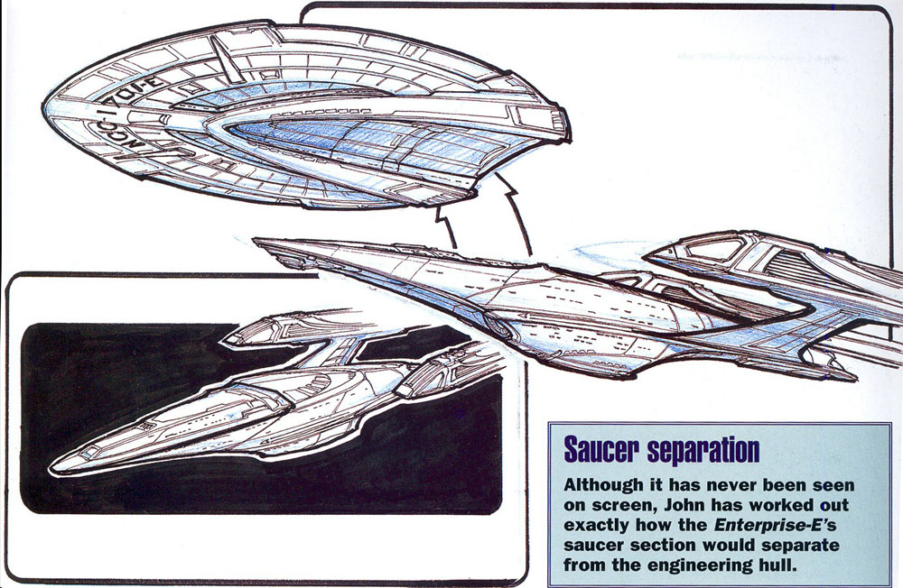
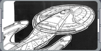
 Eaves also took the trouble to work out exactly how the E's saucer section would separate, even though
this had never been mentioned in the script. "I just knew that the saucer separation was a part of it. I
figured that was something that always had to happen, and I wanted to make sure it had been worked out
beforehand. So it's already been established where the separation line and the break lines would be.
"I wanted the two parts of the ship to look very independent of each other and not as if they had to be
together. I drew a version with the saucer off where it looks like kind of a giant retro dart. I wanted
that part of the ship to look very fast but also aggressive." For all the changes, Eaves says the design
still has many, many traces of Matt Jefferies' original design. "There was a lot of stuff I wanted to
keep from the old ship. There were the two triangles on the saucer, which I found out later were
supposedly landing gear, and the big scoop on the back. Even though we had to change the ship, I wanted
to show that these things still exist." In fact, Eaves admits that he has been slightly surprised to see
how much the Enterprise-E looks like Matt's famous design. "I think it looks more like the original
Enterprise than intended. I think what they did for the motion picture was a perfect kind of
modification on an existing design. That's what I wanted to do - not change it completely, but modify it.
I thought the basic lines were perfect."
Eaves also took the trouble to work out exactly how the E's saucer section would separate, even though
this had never been mentioned in the script. "I just knew that the saucer separation was a part of it. I
figured that was something that always had to happen, and I wanted to make sure it had been worked out
beforehand. So it's already been established where the separation line and the break lines would be.
"I wanted the two parts of the ship to look very independent of each other and not as if they had to be
together. I drew a version with the saucer off where it looks like kind of a giant retro dart. I wanted
that part of the ship to look very fast but also aggressive." For all the changes, Eaves says the design
still has many, many traces of Matt Jefferies' original design. "There was a lot of stuff I wanted to
keep from the old ship. There were the two triangles on the saucer, which I found out later were
supposedly landing gear, and the big scoop on the back. Even though we had to change the ship, I wanted
to show that these things still exist." In fact, Eaves admits that he has been slightly surprised to see
how much the Enterprise-E looks like Matt's famous design. "I think it looks more like the original
Enterprise than intended. I think what they did for the motion picture was a perfect kind of
modification on an existing design. That's what I wanted to do - not change it completely, but modify it.
I thought the basic lines were perfect."
|
|
"DESIGNING THE ENTERPRISE-E" - MARCH 2003 ISSUE 45 STAR TREK: THE MAGAZINE COPYRIGHT OF PARAMOUNT PICTURES.
|