
Star Trek: Insurrection Concept Art (Part 1) - By John Eaves.
John Eaves discusses the design of the new Federation vessels for Star Trek: Insurrection.
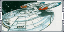 Star Trek: Insurrection called for four new Federation vessels: the captain's yacht, shuttlecraft, a scout ship,
and massive holoship. It was John Eaves job take the familiar Starfleet design elements and create something
new. Eaves explains one of his considers was to make all Federation ships instantly identifiable. "I tried to
carry a lot of the Federation shapes through the design, so that even at a distance you'll have at least
something you can point out and say, 'Oh, that must be a Federation ship because of that.' Even when I was
trying to break from tradition, I still had some elements that would let you know this is the good guys' ship."
The captain's yacht was the first ship Eaves started work on.
This ship actually had its origins with the Enterprise-D: when
Andy Probert designed that ship, he built a separate craft for the captain's exclusive use into the bottom of
the saucer section. The yacht was never seen on television, but
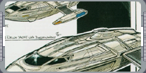 everyone remembered it when designing the Enterprise-E. However
when Eaves did the original drawings for the new Enterprise he concentrated on making it look like a battleship,
and did not spend much time thinking about the yacht. The location of where the yacht was not yet established.
Fortunately, Eaves discovered the ideal spot on the bottom of the saucer with its underside already defined.
"It was more of an accident that the shape of the yacht work out really well, based on that shape down there
[on the saucer]. What was good is that the torpedo launcher on the bottom of the Enterprise has a real nice cut
line on it. We never thought of it at the time, but it worked out really well as the separation line for the
yacht. So, with a few little line changes, we had the bottom of the yacht down. We had the separation from the
line of the torpedo launcher right in the middle of that little tower section, and we could separate the yacht
and still have that launcher as part of the ship."
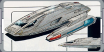 All Eaves had to do was design the top of the yacht. The yacht was mostly used for combat, but the designer
deliberately gave it a smooth, luxurious look that was appropriate for its usual function as a diplomatic and
leisure craft. "I kind of made it a touring vehicle - it's meant to be a very luxurious vechicle. We design it
after a real yacht, so it really has a ship look to it."
The script also called for a new shuttlecraft for the Enterprise. The shape of this was intended to visually
link the two vessels. For the shuttle, I just tried to follow the Enterprise lines, so it's got a real sleek,
aerodynamic look. The aerodynamics don't really matter to the space part of it, but when it is in atmospheric
flight, you get a real nice dimension - a kind of corvettey, kind of streamlined look - that echoed the
Enterprise. That's where that shap came through."
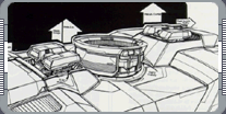 The basic look for Starfleet shuttles was established 12 years ago on Star Trek: The Next Generation, but for
this film the production team seriously considered going in a new direction before reverting to a more familiar
shape. "At one point we were thinking about kind of making a unifold out of the shuttle, so the traditional
nacelles were folded within the shape of the ship. It didn't look as good. It had a nice look to it, but it
didn't say 'shuttlecraft' like having the nacelles separate does, so we went with a more traditional yet real
streamlined look to it. We also went with the standard colors that had been used on TV and in the last film, so
it has that kind of beige-tan color."
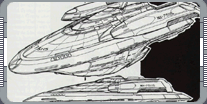 Despite the similaries to the shuttles we have seen before, the new model has some original features, including
docking clamps on the top and bottom and, as with the captain's yacht, a single hatch at the back of the ship.
This kind of subtle change to the basic design of the ships allowed Eaves to establish a continuity between the
new Federation vessels. "What we started doing on this movie was putting the hatch on the very back of all the
ships - the shuttle, the yacht, Data's scout ship; they all have the hatch on the back." The scout ship
represented a real departure from the standard Starfleet design. "The scout was very fun. They just said a
type of Defiant-class ship, so I designed it around the same
elements. The nacelles were built inside the ship - they are encased as opposed to to being exterior - and
everything has heavy armament around it. I kind of went with more of a streamlined look. The side really has a
bulky feel to it; it's meant to be an attck vessel so it has
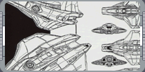 a heavy profile, but from the top it is very streamlined. For the outline I wanted to go with something that
was very distinct from tradition on the top and more aesthetically pleasing shape from the side."
This just left the Federation holoship. Whereas the other ships had proved relatively simple to design, this
one went through several incarnations before the final design emerged. "The holoship went through a lot of
changes. Originally it was a traditional Federation design, so I started out with a saucer section. The way
the village was designed, it lent itself well to that [shape] - a saucer would be the best place to encase that
holodeck image." Director Jonathan Frakes and producer Rick Berman rejected this first design because they
wanted the holoship to look far more industrial, so Eaves went back to the drawing board and came up with
another approach. "They wanted to got with something more freighter-looking. So it went through another stage
where it looked like a Guppy, one of those old 1950's cargo planes. That was my favorite one."
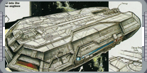 Eaves was pleased with the design, but it was eventually decided that the holoship was too obviously a
Federation craft. Frakes and Berman wanted to hide Admiral Dougherty's involvement with the Son'a plot for a
little bit longer, so Eaves was asked to come up with a third design.
"They felt it still looked too 'starshippy,' so we got rid of that and then moved onto the 'flying brick.' They
wanted something very tankerish, like an oil tanker. I kind of bevelled the sides, and at one point the
cockpit was at the very back of the ship, just like a tanker. So that went for a while, and then they had it
moved to the front. That was the shape that Berman really liked."
|
|
"STAR TREK: INSURRECTION CONCEPT ART (PART 1)" - AUGUST 1999 ISSUE 4 STAR TREK: THE MAGAZINE COPYRIGHT OF
PARAMOUNT PICTURES.
|