
Designing the Delta Flyer - By Rick Sternbach.
The design brief for the Delta Flyer called for a tough, all-enviroment shuttlecraft that combined
Starfleet, Maquis, and Borg technology. The final ship was designed by Rick Sternbach, who worked hard to
find a new and interesting shape.
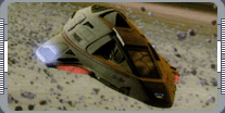 The Delta Flyer began as a fifth season writer concept for
an 'all enviroment shuttle,' capable of deep space missions, atmospheric flight, and planetary landings. The
hull design process began in June 1998, with the usual page upon page of felt-pen doodles, as Sternbach looked
for visual inspirations to get a sense of the overall shape and function of the ship. Descriptions of the
exterior and interior came from the writers and producers as the episode "Extreme Risk" evolved. The crew cabin
would accomodate at least five, with Tom Paris's single offset pilot station at the front, a departure from the
tandem seating from previous shuttles and the runabout. After the
cockpit shape and window frames determined by the set designs, the exterior hull would mirror those elements and
employ that styling, with additional key bits of Borg technology.
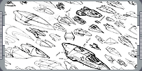 During the doodle stage, various shapes, extensions of Starfleet hardware, were formed from familiar wedges to
streamlined darts. A few sketches looked like miniature Voyager's, or
larger versions of existing shuttles, with elements of the Type 10
shuttle Chaffee. While making the preliminary sketches, a lot of questions came up: warp pods? Where
to put the nav deflector. Phasers? RCS thrusters? How do you get in? One sketch of a pointy hull concept
caught visual effects producer Dan Curry's attention and asked Sternbach if he could develope it more. As
Sternbach developed the Delta Flyer into a more solid mass, more details were added, including impulse nozzels,
blended warp pods in the winds, an entry hatch, Bussard fuel collects, and phasers. Some of the initial
sketches included heavy Klingon shield plating and far too many Borg enhancements (mounted in small cutouts);
which were toned down to just a few, but still visible. The nose-mounted torpedo launcher was
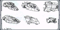 moved underneath, replaced by the navigational deflector array, and two pulse cannons were scratched. The
producers requested that the nose be shortened and round off and to widen the wings.
Several features were added to the Flyer incase they were ever needed in later episodes. Vents and hatches
delineated the warp reactor on the underside; the reactor itself is a flat 'pancake' matter-antimatter chamber
built into the floor. Emergency plasma flush vents were cut into the lower wings and a large drop down Borg
style hatch in the back allowed for entry and for 'mission modules' like the laboratory to be swapped in and
out. A small escape hatch was built into the roof, should the transporters and aft hatch fail, and 'speed
brakes' were scribed into the aft flanks, which could hide all sorts of new devices.
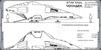
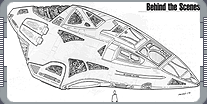 Sternbach had drawn up blueprints as if the Flyer were to built as a physical miniature even though it would be
a computer generated model. CGI modeler Rob Bonchune of Foundation Imaging scanned and inputted the drawings
into Lightwave, 'lofting' the hull into a set of smooth, 3D, shaded objects. Set blueprints of cockpit were
provided to ensure a match with the interior, and color specifications were given to Foundation Imaging for
component 'painting' and building the surface texture maps, based partly on the Flyer set walls and on existing
Starfleet huls and known Borg hardware. In a reverse of the need for set drawings to make the CGI parts,
details of the CGI model were required by the studio mill to build a pair of small walls behind the cockpit set.
This served to hide a set of welded steel frames visible outside the windows, and were finished off with the
proper colors and shapes to appear like the impulse intakes that would be seen looking aft.
 Two years after the initial inception of the Delta Flyer, more additions and modifications to the two sets and
the CGI model were still being made. Escape pods were mentally squeezed into the aft sections, and chunks of
hull plating were torn away. The pods were particulary fun to invent, though they added to a well known but
thorny problem. As sometimes happens with cinematic spacecraft (not to mention some cinematic boats, aircraft,
and cars), the Flyer appeared appreciably larger inside than outside, necessitating a recalculation of the
dimensions of the 'actual' Flyer from a length of about 15 meters to perhaps 21 meters. Earlier, when the aft
station was built for "Timeless," it was a real challenge to fit everything within the conceptual space. The
wingtips just barely clear the shuttlebay opening.
|
|
"DESIGNING THE DELTA FLYER" - OCTOBER 2000 ISSUE 18 STAR TREK: THE MAGAZINE COPYRIGHT OF PARAMOUNT PICTURES.
|