
Designing Borg Ships - By John Eaves.
Before Star Trek: First Contact, the only Borg ship we had seen was the giant cube. For the movie,
illustrator John Eaves was charged with designing not one but two new ships - a sphere and a giant
rectangular vessel.
 When the Borg came to the big screen, Star Trek's producers wanted everything to be bigger and better,
including the Borg's ships. The task of rethinking the Borg fleet for the movie was given to concept artist
John Eaves, a veteran of the Star Trek: Deep Space Nine art department and one of the first people production
designer Herman Zimmerman recuited to work on Star Trek: First Contact. The only established ship was the
Borg cube, and it wasn't surprising that the writers decided that the Borg should also have spherical ships.
The sphere was always intended to be a smaller ship that the Queen used to travel back into Earth's past, but
at this stage the cube was nowhere to be seen; in early drafts of First Contact, the assault on Earth was
carried out by a large tetragon. This posed Eaves with a slight problem - no one in the art department
actually knew what a tetragon
 was! Fortunately, as Eaves recalls, before he'd even had time to look for his dictionary, the writers and
producers provided a little clarification. "They wanted different shapes that were kind of along the lines
of a cube, but not really the cube; they thought we maybe needed a different look because we'd seen so much
of that ship." With this brief in mind, Eaves settled down to work on the two designs. He started out with
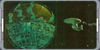
a sphere. As he explains, his biggest worry was that spherical 'ships' had already featured heavily in both
'Star Wars' and 'Starman.' "Everyone who knows 'Star Wars' was thinking 'Death Star.' We actually went over
to one of the producers' offices and said 'We're kind of concerned about the sphere shape.' I had this giant
'Star Wars' book and I opened it up to the Death Star and said, 'I think viewers might confuse the two.' He
looked at it for a long time then he said, 'No one will ever remember this!"
 Joking aside, everyone was determined to make sure that the Borg sphere was a distinct ship with its own
identity. One of the first things Eaves did was to call John Goodson, the Industrial Light & Magic
modelmaker who would be building the ship, and tell him they needed to do everything they could do make the
sphere look new and interesting. Then Eaves started to turn out a series of drawings for his boss Zimmerman
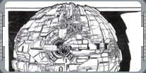
and the producers to look at. Eaves says the basic design for the sphere came together quite swiftly, but he
did explore a few dead ends before he settled on the final look. "At one point it was going to be little
spheres inside of a sphere, then it grew away from that. I actually came up with a sphere with open holes at
either end; you can't really see it, but there is a sphere inside a sphere. My first drawing was of a
staggered puzzle-piece looking sphere. It had a little escape pod inside of it and you could see this kind
of undersphere under the surface.
 That was a good direction; Zimmerman and Rick Berman liked it. They told me to keep going and to keep the
shapes really irregular; they didn't want any mathematical patterns whatsoever. So I took it a little bit
futher, and made the next one with really raised surfaces and very inset surfaces."
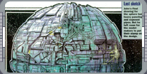
This design was very close to what everyone was looking for but, Eave explains, it had a major flaw that
needed to be corrected. The script described how the sphere would fire on Zefram Cochrane's complex on the
surface, so he had to design a large weapons platform that was made up of a series of rings that went deep
inside the ship. "They wanted an open hole with some rings, but that didn't look too like the Death Star, so
we got rid of it. It's still there on the final ship, but it's covered by paneling. Finally, I did one with
giant exposed pipes on. They seemed to like that." Eaves wasn't the only illustrator working on the movie;
Ricardo Delgado,
 another Deep Space Nine veteran, had been asked to take a look at the Borg themselves. In his spare time, he
threw out a couple of designs for their ships.
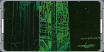
His designs for the Borg Queen and her drones were heavily influenced by the ancient Egyptians, so he
suggested that the still-undefined larger ship should be an obelisk with the sphere set into the top. His
version of the sphere was also radically different to anything seen before; one half would be made up of
traditional Borg panels, but the other half would be a forcefield that contained gaseous energy, which the
sphere used for fuel. Meanwhile Eaves was producing his own designs for the larger Borg ship. His first
drawing was of a large, rectangular ship, rather like an enormous Borg brick. "The first one I did was very,
very smooth; that was when it was still very large. It was this reflective block and it had all these inset
passages you could fly through or other things could fly out of. They said, 'Ok, that's kind of cool. Let's
carry that a little bit futher,
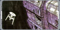 but not so smooth; we need that Borg detail.'"
However, back then Borg detail wasn't very clearly defined. The original model of the cube had only been
designed for television and could never have stood up to cinematic presentation; according to Eaves, it was
essentially made up of model trees - the bits of plastic that are left behind when you've assemled a model
kit. So, he had to design the detail himself. Thankfully, he says, this didn't mean he had to draw every
individual hatch and panel. "I knew that Goodson was going to work on the model - they were going to use
brass etch, and there's really no way you can draw it - so what I did was just a guideline for the kind of
shapes. I try to do that with all the drawings I do; I leave a lot of the spaces open so the modeler can be
part of the creative process."
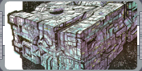 Eaves' second pass suggested there would be much more paneling, and showed large, recessed areas. "The next
one's got very lateral planes and a very uniform shape. They liked the idea of the detailing on it; it had
ribbon-shaped canyons. They liked the feel of that, but they felt that the pattern was too mathematical."
So, in his third pass, Eaves concentrated on breaking up the design of the ship and avoiding any kind of
regular pattern. "That was also rectangular, but it's got a lot of really deep valleys and its got a little
round escape sphere on the surface. That one they really liked; they said 'Let's go with that.' They sat
with it for a week or so, then they came back and said, 'We're going to go with the cube shape.'" It should
be explained that, throughout the design process, the size of the ships kept changing. The relative sizes of
the sphere and the large ship stayed the same. At one point the sphere was 3,000 feet across, which meant
that the 'mother ship' was "gargantuan." The final version of the sphere was only 1,500 feet across, which
it considerably smaller than the Enterprise. The point is that the changing size of the ships had a major
impact on the kind of
 detail Eaves was putting on his designs. When the ship was enormous, Eaves made the detail much smaller to
create a sense of scale; when it was smaller, he brought the size of the detail up.
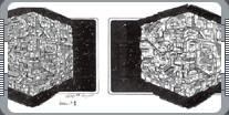
When he drew his first Borg cube, it was suppose to be vast, so the surface was filled with detail. As Eaves
says, nobody really liked the look of this cube. "The first one was really overly detailed. That's where I
started incorporating 45-degree lines all throughout it. They liked that; it was very intricate, but it was
too busy, so they had me go with version two. That was the same breakup; I started putting a heavier panel
on top of it and incorporating the escape hatch. That was more the direction they were wanting, so Zimmerman
had me do a color pass on it. That one has the hatch on the left-handed side; for the very final pass they
had me put the hatch on on the right side and they went back to a little finer detail. It was almost going
back in a full circle back to the first sketch. It had a little bit of heavier panel but more of the
fine-scale stuff." When
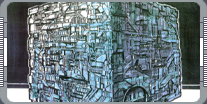 you look at Eaves's drawings, the hatch the sphere emerges from is easily identifiable; this wasn't the case
in the movie, when the sphere emerged from a concealed hanger. Eaves explains that the change was actually
made while the model was being constructed.
"As the model went on, they decided to keep the door hidden, so it wouldn't be seen during the attack and
wouldn't be revealed until the very last moment. On all the drawings you can see where the port is; that
established where on the cube that hatch is, but, in fact you never saw it except for that one where it
opens, so really it could be anywhere." Since the sphere made its debut, it has become a regular feature on
Star Trek: Voyager, and we've learned that the Borg have several kinds of vessel, from the peanut-shaped
probe to the heavily-armored tactical cube. But, the process of reinventing the Borg ships began with First
Contact, which brushed aside many of the boundaries that had restricted the look of the Borg fleet.
|
|
"DESIGNING BORG SHIPS" - MARCH 2001 ISSUE 23 STAR TREK: THE MAGAZINE COPYRIGHT OF PARAMOUNT PICTURES.
|