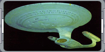
Designing the U.S.S. Enterprise NCC-1701-D - By Andrew Probert.
When Andrew Probert joined the staff of Star Trek: The Next Generation one of his dreams came true: he had
the chance to completely redesign the legenary USS Enterprise.
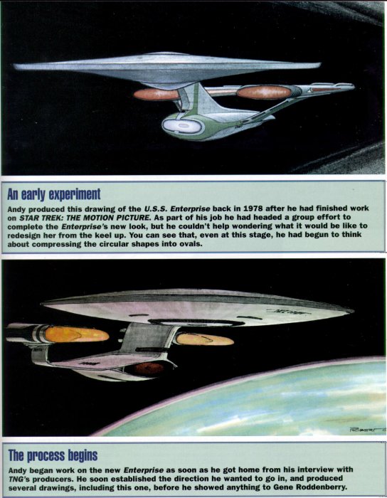
 Andrew Probert always wanted to redesign the Enterprise. He'd gotten his hands on it once, when he was working
on the Star Trek: The Motion Picture. Then, he'd updated the ship, working with some modifications that had
already been made up by Matt Jefferies and Joe Jennings, and he didn't have the chance to create a new version.
After his job interview with the TNG producers, he felt there was a good chance he might finally get to design
his own version of the famous vessel. He couldn't wait to hear whether he'd got the job or not, and started
drawing as soon as he got home. He remembers that he that he wanted to make the ship look more advanced and to
give it a sense of movement.
Andrew Probert always wanted to redesign the Enterprise. He'd gotten his hands on it once, when he was working
on the Star Trek: The Motion Picture. Then, he'd updated the ship, working with some modifications that had
already been made up by Matt Jefferies and Joe Jennings, and he didn't have the chance to create a new version.
After his job interview with the TNG producers, he felt there was a good chance he might finally get to design
his own version of the famous vessel. He couldn't wait to hear whether he'd got the job or not, and started
drawing as soon as he got home. He remembers that he that he wanted to make the ship look more advanced and to
give it a sense of movement.
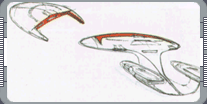
Probert says, "I was so pumped up that I started right in, sketching my little heart out. Knowing that the new
series was to be at least a hundred years hence (which later got changed to 85 years), I felt that it would be
faster and probably sleeker if there was any influence from hyperlight dynamics. At least it should be more
elegant, I felt. The saucer had, since its inception, been the main section,
 so I made it larger in proportion to the secondary or engineering hull. I previous designs the warp nacelles
were always to the rear but above the saucer rim, which visually seemed to give them equal importance, and
physically placed them above the ship's center of mass. Both of these seemed to be negative point, which I
hoped to remedy by lowering them to a position between the two hull sections. This would place them closer to
the ship's center of mass. Also, the struts holding the saucer and warp engines were slanted in opposite
directions; the saucer is going forward, engines going back. That wasn't bad but it created a slight visual
conflict, so I slanted them all forward to unify their direction and give the orverall design a feeling of
aggressive forward movement, like a lunging cat. The view from the front of the old ship produced a variety of
shapes. I took my design theme from the saucer and started sketching every component as a compressed oval."
so I made it larger in proportion to the secondary or engineering hull. I previous designs the warp nacelles
were always to the rear but above the saucer rim, which visually seemed to give them equal importance, and
physically placed them above the ship's center of mass. Both of these seemed to be negative point, which I
hoped to remedy by lowering them to a position between the two hull sections. This would place them closer to
the ship's center of mass. Also, the struts holding the saucer and warp engines were slanted in opposite
directions; the saucer is going forward, engines going back. That wasn't bad but it created a slight visual
conflict, so I slanted them all forward to unify their direction and give the orverall design a feeling of
aggressive forward movement, like a lunging cat. The view from the front of the old ship produced a variety of
shapes. I took my design theme from the saucer and started sketching every component as a compressed oval."
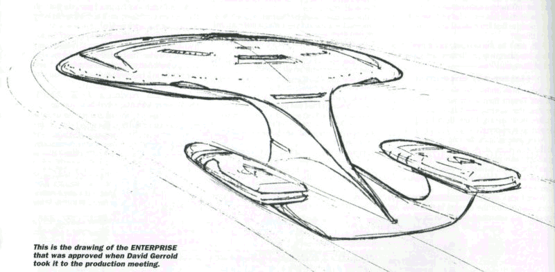
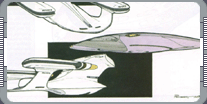
The producers were concerned with the main bridge, Probert always believe the it is important to have the
interiors match the exteriors, so he brought in one of the sketches he felt was working and pinned it up on the
wall so he could analyze it as he worked on the ship's nerve center.
 David Gerrold [writer and producer] walked in and said, 'Hey, is that the new ship?' Of course, I told him I
didn't know if it was or not, because I hadn't shown it to anybody. He pulled it off the wall and continued on
to his meeting with Gene and the other producers. He held the drawing up and said, 'What do you think of this?'
and they all liked it. He came back and slapped it on my table and said, 'Yep, that's the new ship.' I was
flabbergasted. I'd never heard of a design going through that quickly, and it was very close to what I ended up
producing."
David Gerrold [writer and producer] walked in and said, 'Hey, is that the new ship?' Of course, I told him I
didn't know if it was or not, because I hadn't shown it to anybody. He pulled it off the wall and continued on
to his meeting with Gene and the other producers. He held the drawing up and said, 'What do you think of this?'
and they all liked it. He came back and slapped it on my table and said, 'Yep, that's the new ship.' I was
flabbergasted. I'd never heard of a design going through that quickly, and it was very close to what I ended up
producing."
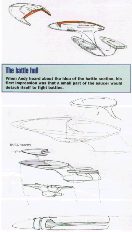
The overall design may not have changed much, but there was one very important thing Probert didn't know about
the new Enterprise - the producers actually wanted it to separate into two sections. Unfortunately, his new
design really lend itself to this. The situation was complicated because Probert misinterpreted their original
brief. "The way they described it was that the Enterprise would have a battle section that would separate from
the ship. I thought, 'Now you tell me!' I'm thinking, 'Hmm, a battle section that would leave the ship.' I
thought maybe it was like an auxiliary craft or something that separated to go off and fight battles. What I
came up with was a shape like the letter D. If you lay that down on top of the saucer with the round part
toward the front and then extend the serifs, those would be two warp engines. This thing would be nestled into
the top of the saucer and it would separate to go fight the battles.
 When I showed this to them they said, 'No, no. What'll happen is the saucer separared and the engineering hull
then becomes the battle section.' So I have this dorsal sculpted into the saucer and now I have to seperate
that and still make it look good both ways, which was an extraordinary chanllenge. I started playing with it
and I found if I left part of the saucer on the dorsal then it could be a very broad mounting point for the
saucer as well as hopefully making the engineering hull look a little better." Probert new there was a
precedent for the idea of a saucer seperate; in "The Apple," Kirk tells Scotty that, if he has to, he should
break out of orbit with the main section. In fact, Probert always assumed that the original Enterprise had
landing gear. "Popular opinion indicated that the two triangular points on the underside of the saucer are
actually two landing legs; the third one would be in the dorsal cavity, so the saucer would have tricycle
landing gear for planet landing. Carrying that into Star Trek: The Motion Picture Enterprise I designed four
landing pads on the underside of the saucer. When I did the D, I started to do that and was distracted
away from it and that poor ship eventually paid the price!" Once the separation sequence had been sorted out,
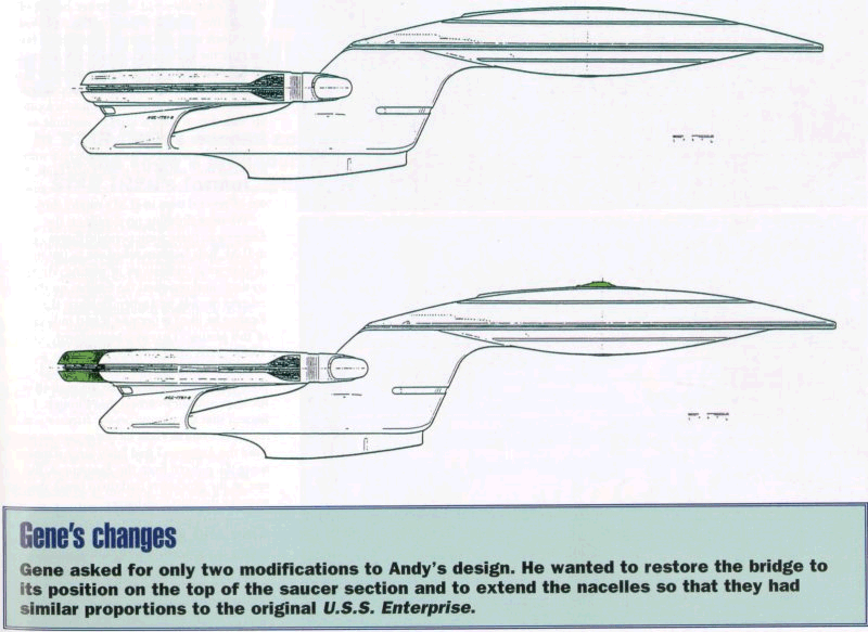
Probert wasn't asked to make any more drastic modifications to his design. However, he says that Gene was
concerned by the length of the warp nacelles.
When I showed this to them they said, 'No, no. What'll happen is the saucer separared and the engineering hull
then becomes the battle section.' So I have this dorsal sculpted into the saucer and now I have to seperate
that and still make it look good both ways, which was an extraordinary chanllenge. I started playing with it
and I found if I left part of the saucer on the dorsal then it could be a very broad mounting point for the
saucer as well as hopefully making the engineering hull look a little better." Probert new there was a
precedent for the idea of a saucer seperate; in "The Apple," Kirk tells Scotty that, if he has to, he should
break out of orbit with the main section. In fact, Probert always assumed that the original Enterprise had
landing gear. "Popular opinion indicated that the two triangular points on the underside of the saucer are
actually two landing legs; the third one would be in the dorsal cavity, so the saucer would have tricycle
landing gear for planet landing. Carrying that into Star Trek: The Motion Picture Enterprise I designed four
landing pads on the underside of the saucer. When I did the D, I started to do that and was distracted
away from it and that poor ship eventually paid the price!" Once the separation sequence had been sorted out,
Probert wasn't asked to make any more drastic modifications to his design. However, he says that Gene was
concerned by the length of the warp nacelles.
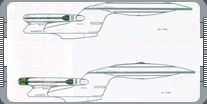 "My drawing had very short nacelles because I wanted to indicate that stardrive technology had become more
powerful. It's like television today; they can make them to fit inside a watch. That's sort of what I based
my thinking on: the face that you could have warp drive in a new, smaller container. Gene wasn't comfortable
with that because he was so used to those huge warp engines from the original series that this seemed
underpowered to him, so he said, 'Make the engines a little bit longer.' I made them as little longer as I
could because if you look at that side view you'll see that there's an echoing of shapes. I'm going from the
saucer doral curving forward into the saucer and then I was going from the pylons curving forward into the
nacelles. They are at the same angle. My whole intent was to unify all of those shapes; I wanted to give it a
forward lunge for the saucer and a forward lunge for the engines, but Gene still wanted the engines to extend
out the back as well." Gene's only other change was to put the bridge back on the top of the saucer, as it had
been in the original Star Trek. Probert already put a window here, and adding the bridge simply created a small
bump. As Probert explains, he'd already made his own change to the underside of the saucer. "In the original
show the dome on the bottom of the ship was a sensor array. What I did was move the sensor array to more of a
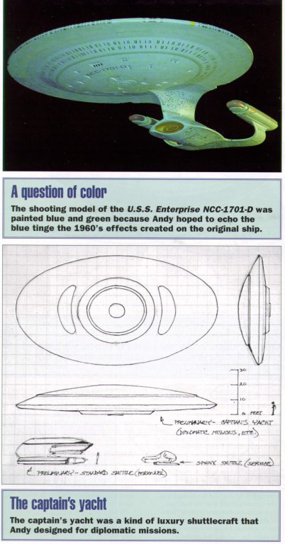
surrounding detail, leaving the dome on the bottom free. That's where I put the captain's yacht, which is a
private vessel for dignitaries and captains of ships to use as personal shuttles. That was never used in the
show. At one point there was a script where Picard was returning to the ship and the dialogue was, 'The
captain's shuttle is on the way back. Crew members, man your stations.' Then the captain comes aboard. We
never ever have a visual, so I suggested mentioning the yacht, but they decided against it."
"My drawing had very short nacelles because I wanted to indicate that stardrive technology had become more
powerful. It's like television today; they can make them to fit inside a watch. That's sort of what I based
my thinking on: the face that you could have warp drive in a new, smaller container. Gene wasn't comfortable
with that because he was so used to those huge warp engines from the original series that this seemed
underpowered to him, so he said, 'Make the engines a little bit longer.' I made them as little longer as I
could because if you look at that side view you'll see that there's an echoing of shapes. I'm going from the
saucer doral curving forward into the saucer and then I was going from the pylons curving forward into the
nacelles. They are at the same angle. My whole intent was to unify all of those shapes; I wanted to give it a
forward lunge for the saucer and a forward lunge for the engines, but Gene still wanted the engines to extend
out the back as well." Gene's only other change was to put the bridge back on the top of the saucer, as it had
been in the original Star Trek. Probert already put a window here, and adding the bridge simply created a small
bump. As Probert explains, he'd already made his own change to the underside of the saucer. "In the original
show the dome on the bottom of the ship was a sensor array. What I did was move the sensor array to more of a
surrounding detail, leaving the dome on the bottom free. That's where I put the captain's yacht, which is a
private vessel for dignitaries and captains of ships to use as personal shuttles. That was never used in the
show. At one point there was a script where Picard was returning to the ship and the dialogue was, 'The
captain's shuttle is on the way back. Crew members, man your stations.' Then the captain comes aboard. We
never ever have a visual, so I suggested mentioning the yacht, but they decided against it."
 Nevertheless, the captain's yacht became an established feature on modern Starfleet ships. We finally got to
see one in action in Star Trek: Insurrection; the USS Voyager has a similar vessel, and Rick Sternbach has put
them on the Starfleet ships he's designed, up to and including the USS Equinox.
Nevertheless, the captain's yacht became an established feature on modern Starfleet ships. We finally got to
see one in action in Star Trek: Insurrection; the USS Voyager has a similar vessel, and Rick Sternbach has put
them on the Starfleet ships he's designed, up to and including the USS Equinox.
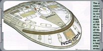
There are a few other details that Probert built into his Enterprise that have puzzled people. In particular,
he says, a lot of people have asked him about the vartical windows in saucer section; specifically, they wanted
to know how big they are. "They would scale out to about three and a half feet across and their length would
vary according to what deck they were on. The way that I came up with that originally was that, if you think of
a porthole on an ocean liner, it's usually set at an average height of around five feet, so any normal-sized
person could look out of it. I started with that, but such a radical angle my thinking was, 'Where do put a
porthole so everybody, short or tall, could look out?' The solution I came up with was to have a verticle
porthole so people of any size could use it." Other elements of Probert's Enterprise were finalized only when
the model was built. For example, he says, the surface texture came out of several trips to ILM's model shop.
"We were finishing up details on the Enterprise so there were periodic flights up to ILM. Bob Justman asked me
to put in a lot up there and reviewed the finishes on the existing models, and when Bob saw the Excelsior he
liked it because it had indications of this plating. That idea started in Star Trek: The Motion Picture; my art
director Richard Taylor thought a subtle plating pattern would add to the realism of the ship, and they carried
that through. I figured out that the plating on the Excelisor scaled out to as eight inches across, so when I
did the Enterprise I had fairly large panels using the pattern from the Enterprise-A. But one of the producers
had them break that up to make the ship look bigger."
 One thing has probably caused more debate than else: the Enterprise's color. The model is very definitely blue,
but on screen the ship is gray. Probert explains that there is a very good reason for this. "The fans were
very concern that we were replacing the original series. In order to soften some of the anxiety I wanted the
two ships to be colored basically the same. Well, because of the low degree of technology compared to today,
when the original Enterprise (which was actually a warm pearl gray) was filmed it picked up a lot of the blue
spill [light used in the visual effects process] and therefore became bluish. What I did was indicate that the
paneling of the D be painting in two shades of blue. One is a duck egg blue, and the other is kind of a
sky blue, which is the base color the hobby kits are molded in. By mixing the two blues together I was hoping
cinematically that there would be a close tie-in with the color of the original ship." However, the blue was
neutralized when the ship was filmed, leaving it the familiar gray.
One thing has probably caused more debate than else: the Enterprise's color. The model is very definitely blue,
but on screen the ship is gray. Probert explains that there is a very good reason for this. "The fans were
very concern that we were replacing the original series. In order to soften some of the anxiety I wanted the
two ships to be colored basically the same. Well, because of the low degree of technology compared to today,
when the original Enterprise (which was actually a warm pearl gray) was filmed it picked up a lot of the blue
spill [light used in the visual effects process] and therefore became bluish. What I did was indicate that the
paneling of the D be painting in two shades of blue. One is a duck egg blue, and the other is kind of a
sky blue, which is the base color the hobby kits are molded in. By mixing the two blues together I was hoping
cinematically that there would be a close tie-in with the color of the original ship." However, the blue was
neutralized when the ship was filmed, leaving it the familiar gray.
|
|
"DESIGNING THE U.S.S. ENTERPRISE NCC-1701-D" - AUGUST 2000 ISSUE 16 STAR TREK: THE MAGAZINE COPYRIGHT OF
PARAMOUNT PICTURES.
|